

TOOLS
figma
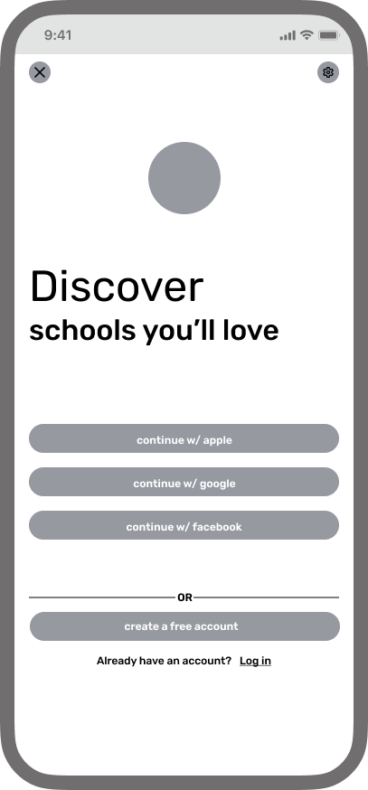
SCHOOLS YOU AND YOUR CHILD WILL LOVE

user research
design systems
interactive design
visual design
ROLE
lead designer
TIMELINE
april - may 2023
SKILLS
an all-in-one search platform for users looking to get a kickstart in the school search for their children
PROJECT OVERVIEW
expedite the school search, while connecting users and their children their future school
DESIGN GOAL
TARGET AUDIENCE
users with children in the pre-k - 12th grade age range
USER GOAL
users are looking for a more straightforward and streamlined experience when searching for a school for their child
PRODUCT GOAL
create a product for a gap in the marketplace
platform
mobile iOS

prototype
the problem
creating an app for a gap in the marketplace
How can I create a one-stop school search platform for users seeking the best match for their children?
How can I create a one-stop school search platform for users seeking the best match for their children?


the process
design
develop a visual design and experience creates a solution for the user
research
discover what the user’s needs and wants are
strategize
decide on what features are the most essential for the user
revise
make adjustments based on findings during user testing
test
test how the app addresses user needs and discover pain points
essential features and future design choices
strategize
Through my research I knew that the main search and filter functions of the app would be the most important features for the user. The main pain points the users mention are the lack of a centralized search resource and time consuming
search bar

I needed to determine what information would be essential to have on the school cards. Via user testing, affinity diagrams, and empathy mapping I was able to come up with the essential headings needed
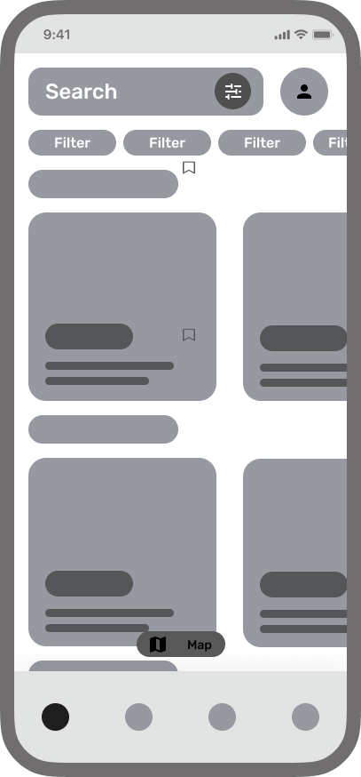
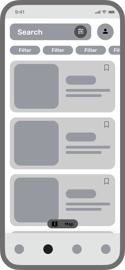
school cards

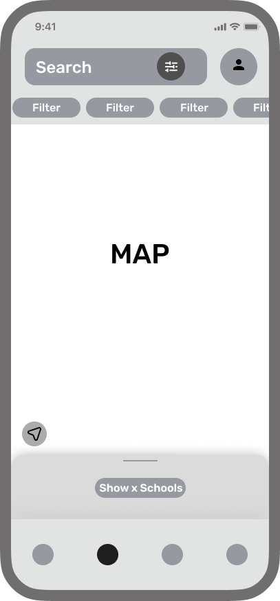
Users complained of stress and being overwhelmed with the amount of school choices. To combat this I wanted to determine whether going with horizontal sliders divided into sections, or working with a vertical card layout would be best. In order to make the best design choice, I made this one of my priorities while conducting my user tests
horizontal cards vs vertical sliders


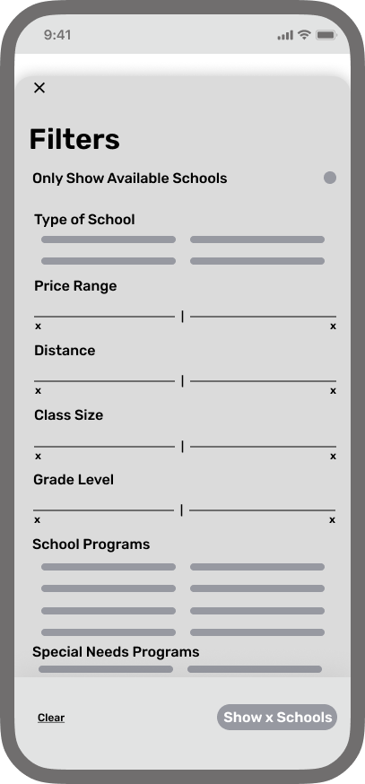
During my competitive analysis, I found that the lack of organization frustrating. I knew that I wanted the filters to be extensive but purposeful, so I looked outside the eduction field for inspiration. Using AllTrails and AirBnb often in my own personal explorations, I looked to them for some insights. After completing another competitive analysis in their respective fields I was able to come up with a set of filters to test
filters


design
wireframes
test
user testing and findings
users are looking for a more straightforward and streamlined experience when searching for a school for their child
USER GOAL
users with children in the pre-k - 12th grade age range
DESIGN GOAL
expedite the school search, while connecting users and their children their future school
TARGET AUDIENCE
revise
revisions for the final designs
Horizontal sliders made the best use of space, with the most amount of information for the user. Cards we laid out based upon school name, type, cost, location, and peer ratings
Filters were the key driver to give the user the most precise choice when deciding on what school they wanted their child to go to
Letting the map take the largest amount of space possible allowed the user to make well informed decisions about the location of the schools they were interested in